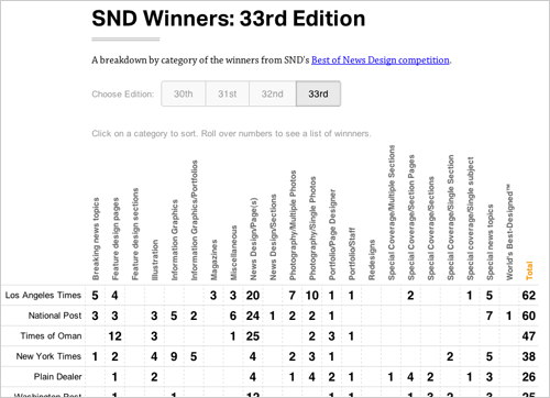
The Society for News Design’s annual contest is one of the handful of design and infographic contests that we enter each year. They’ve got a database online that lets you search the winners, but while it’s great for looking up your entries to see if you’ve won, it’s a little harder to get the a sense of the big picture — for example, which papers are great at features page design, which ones excel at news page design and which ones win for their photography or information graphics.
So, I figured there must be a better way to display the data that lets get a sense of how different publications do in the different categories. So, a little bit of Ruby and Javascript later, I hacked together an interactive crosstab of SND winners. Check it out. (Modern web browsers only, please)
